
M1: How a design flaw slowed down Apple’s VNC
In February 2021, Scaleway introduced the Mac mini M1 from Apple. It quickly sold out, and I was put in charge of the massive restocking we needed. But there was one big problem: the VNC was slow.
At Scaleway, design has always held a special place. We strive to have an emotional approach through the aesthetics of our tech identity. Beyond our products’ design representation, we should also reflect the strong passion of our employees for developing solutions.
As designers, our role is to create emotions, tell stories in our visuals, while highlighting the work of hundreds of talented engineers (we're hiring by the way ;)) who are building the Cloud of tomorrow.
Creating design approach for cutting-edge, high-tech products is an exciting daily challenge, and we wanted to tell you how we succeed to create a library of robust design assets for our cloud products ecosystem.
In early 2018, Scaleway launched the first building blocks of its future Cloud Ecosystem. With more than 20 products in 18 months, we had to quickly represent our new products in our communications. Beyond the nice pictures of our dedicated servers, we had to begin imagining a graphic system for our managed products while still creating our own graphic identity.
Cloud products iconography is not really defined among cloud providers. Bringing immaterial products to life in a fairly young market is a real challenge, and every provider does it in their own way:
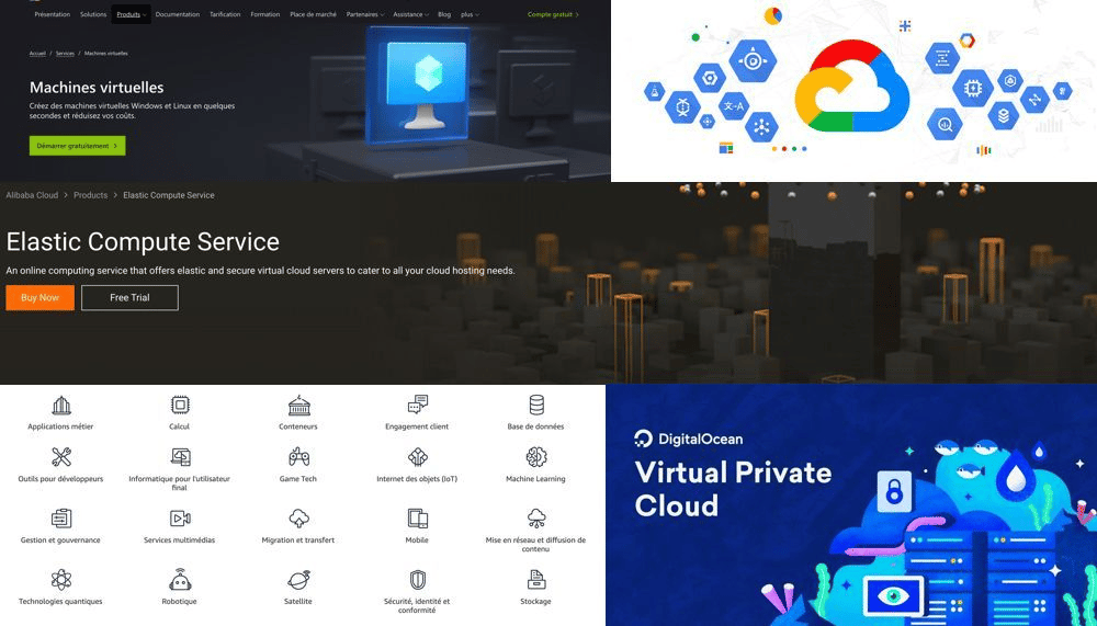
Pictogram, 3D or 2D illustration, there is one for everyone's taste!
How to differentiate Scaleway's innovative approach through design?
Within the Design team, aligned with our art direction, we quickly decided to include a 100% dedicated illustrator to enhance our iconography and bring emotion to our work. It was clear that we wanted an illustrative direction with very aesthetic visual renders, less conventional. Our ambition was to stand out using the powerful tool that is illustration.
Space-inspired design was a graphical approach we really liked from the start. It was aligned with our scaling an innovative market, full of promise. We then had to find a sorting logic for our products. We naturally gathered them by categories (Compute, Storage, Network, IoT) and during our brainstorming sessions with product managers and marketing teams, we came up with the idea of associating these product groups with different material types:
Our visual cloud products ecosystem was born!
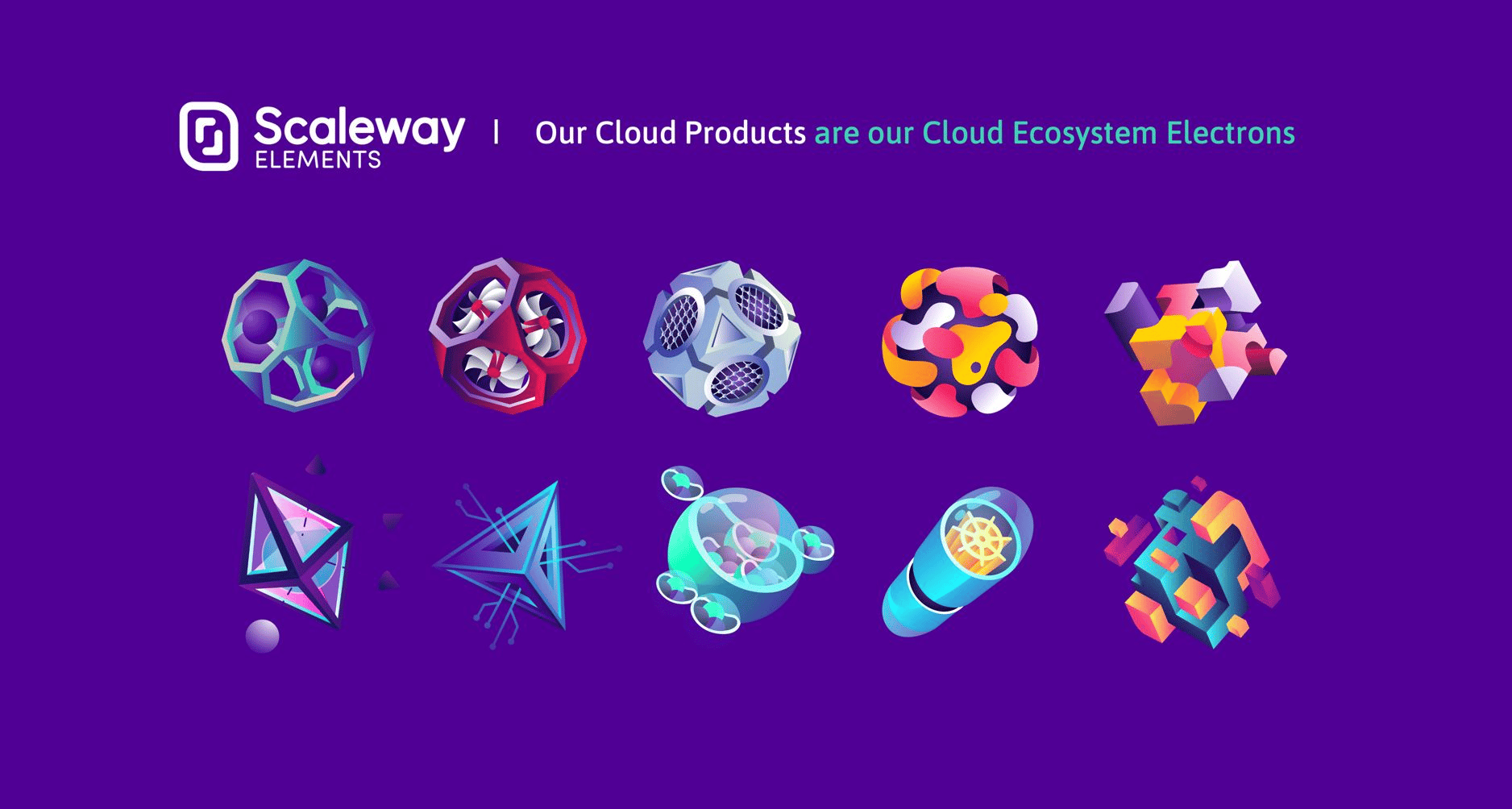

Three watchwords: space, aerial, dynamic! Scaleway landed in the Cloud universe, and we wanted it to stand out ;)
This first step greatly contributed to the success of our first cloud bricks.
As our offers evolved, our product strategy was increasingly focused on industry standards with key concepts such as multi-cloud and interoperability. The more we moved forward with this mindset, the more we thought it was time to streamline our graphic language. After a year and half of loyal service, we had to adapt our approach and move towards a more straight to the point, less exclusive and more mature visual system.
We created a new work process in order to assimilate tech industry visual language, while maintaining our graphic identity.
Before creating beautiful artworks, the need for a set of pictograms representing our cloud products panel was growing. So we had to start from there: find the most crystal clear pictogram for each product. A visual representation that makes sense to as many people as possible and especially to those who use these products on a daily basis. Benchmarking on tech visual language was necessary. Involving engineers and making collective validation was part of the process, having their approval on the pictograms' meanings was essential. We needed to create solid foundations before having fun.

Most common visual representations when looking for "virtual instance" icons
The second step was to integrate Scaleway brand into the pictogram. So the designer's job in this case is to work on the validated foundation but keep the design meaningful.

Next step: once the stylized icon is validated, we move on the illustrative and artistic direction part. This piece of work is the raw material for our future communication, marketing and website assets. As our illustrator has his own graphic approach, the idea is to give him enough space to create while still keeping the Scaleway universe and the consistency between each product in mind.
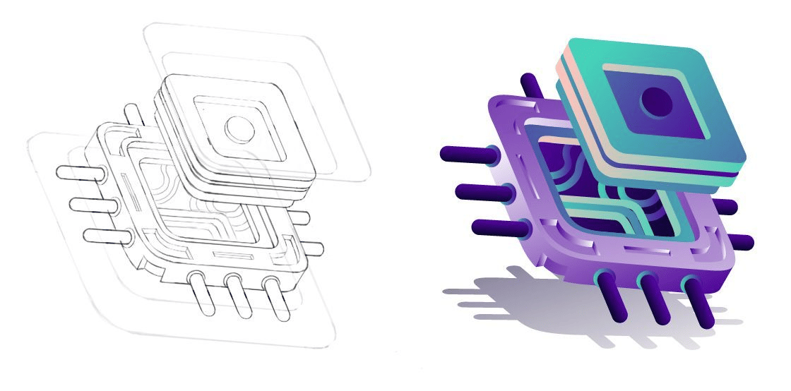

Moving on from Illustrator artboards, it's time to apply our approach to concrete deliverables: marketing declination becomes easy. The pictogram trio (visual tech standard) + text content (the message) + illustration (the story we're telling) works well, with a nice balance.
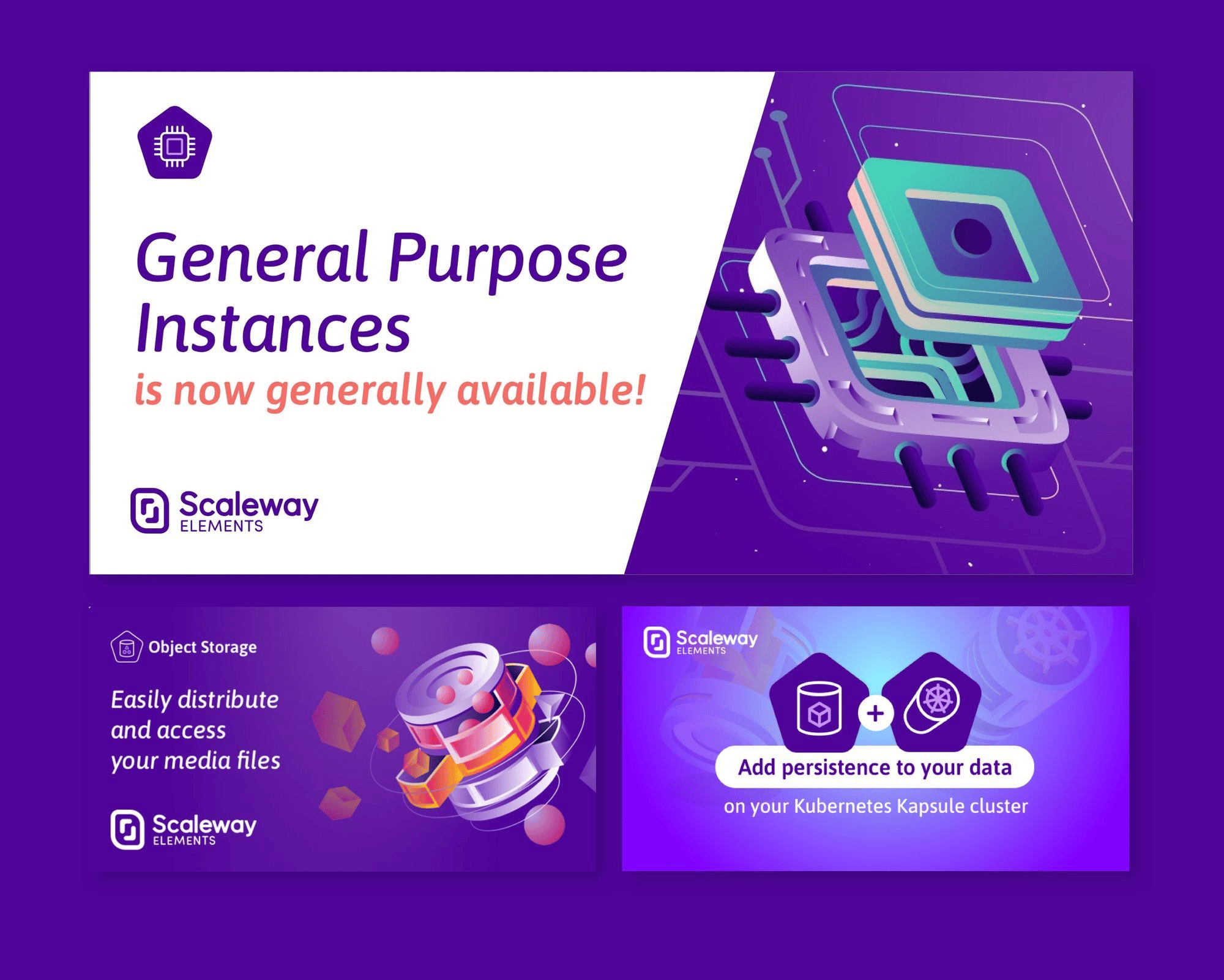
The idea here is to keep the same visual codes for our other universes, from BtoB to infrastructure diagrams or console interface, allowing customers identify which product we are referring to, in a more technical context.

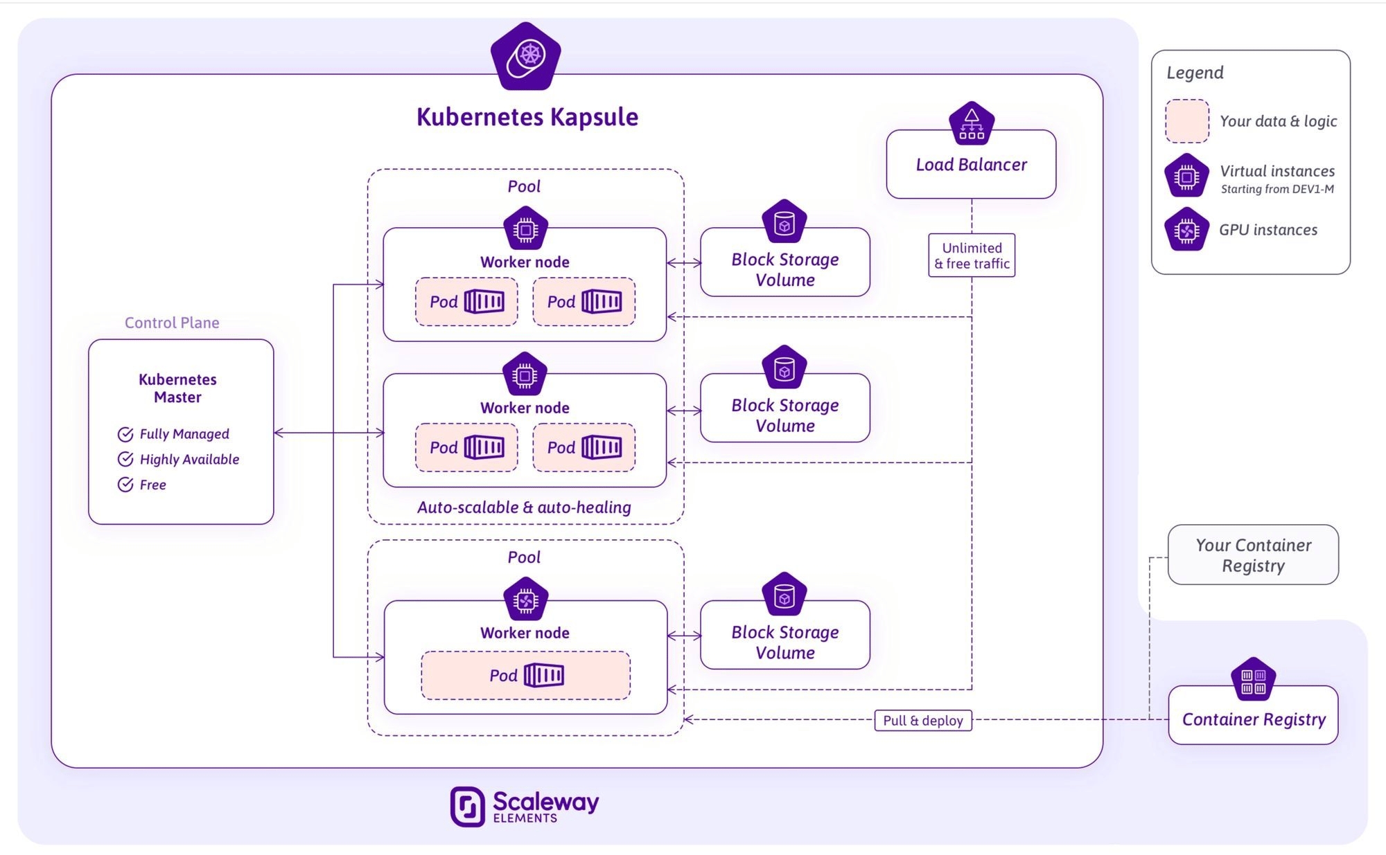
Our internal asset libraries, where everyone (sales, project manager, engineers) can easily find our elements, and speak a common language when they want to communicate on a product, are regularly kept up to date.
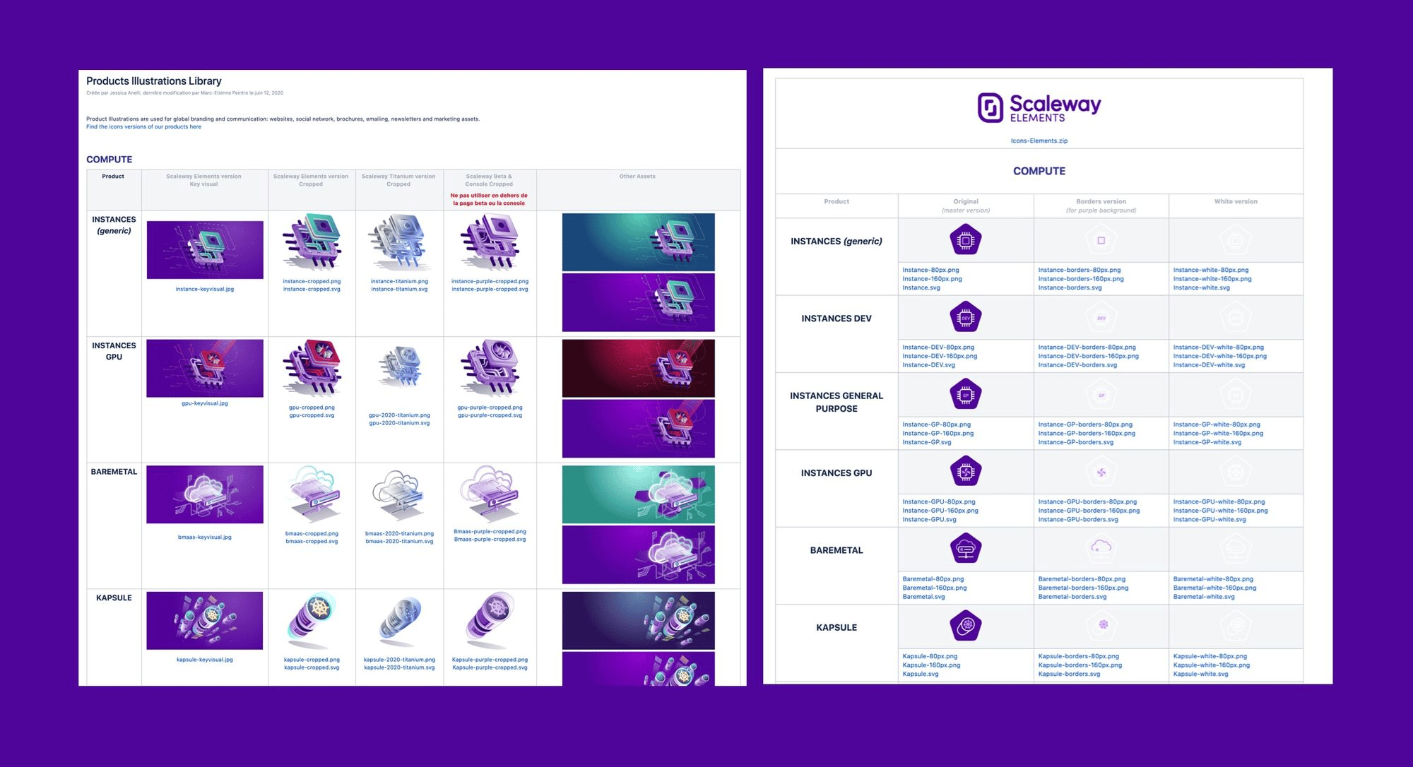
This process has been applied to each of our products, and allows us to support our content and documentation around our cloud ecosystem.
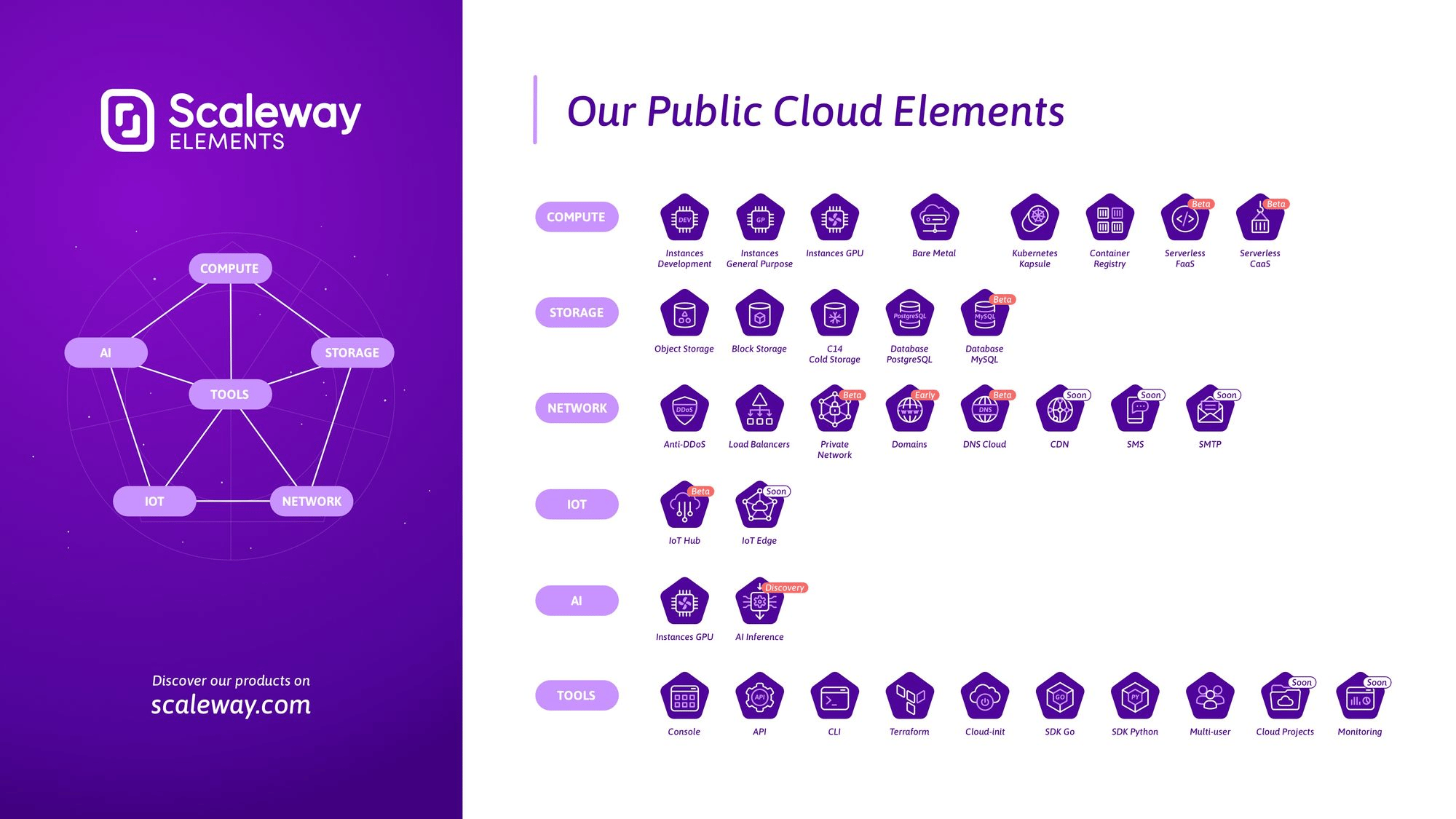
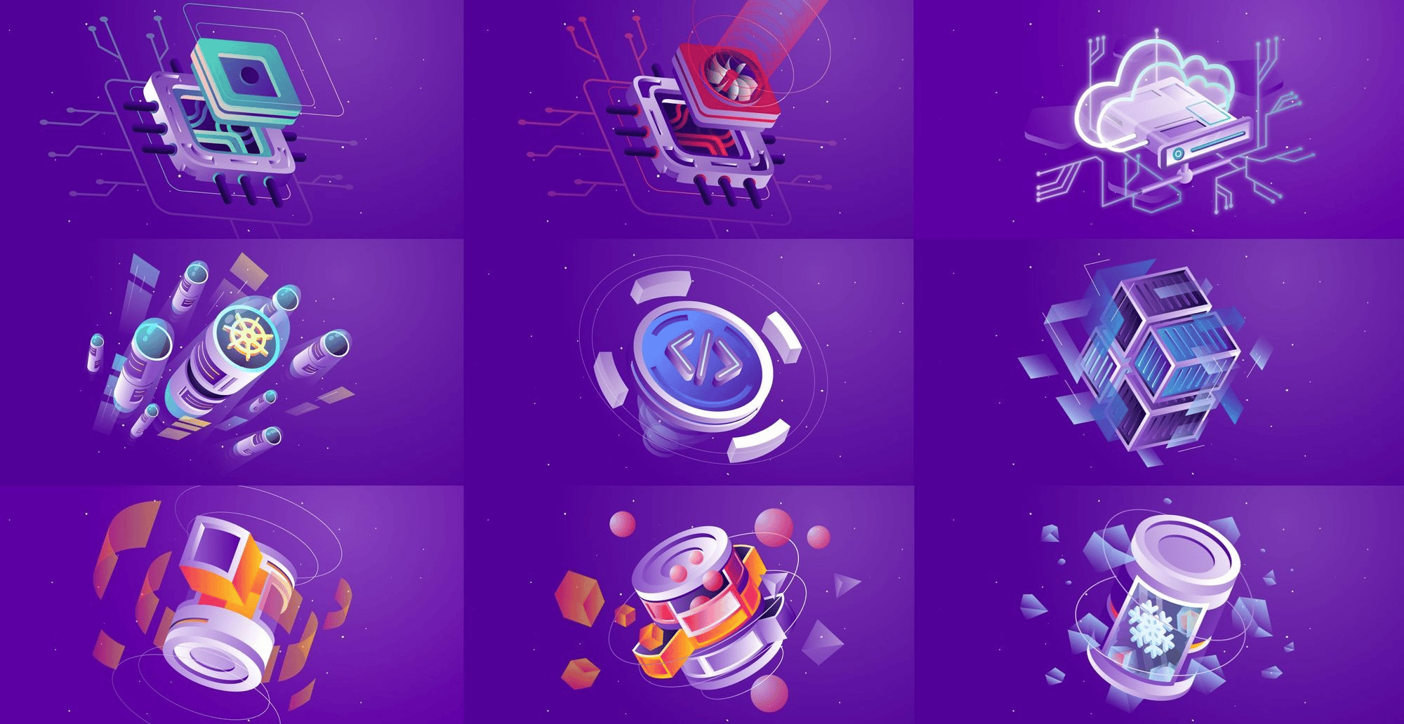
Our cloud offer is constantly evolving, it would not be surprising if we had to review our graphic aproach again soon. In the meantime, we are very proud of the result.
Thank you for reading!
Are you interested in this type of content about design process at Scaleway? Feel free to share your feedbacks :)

In February 2021, Scaleway introduced the Mac mini M1 from Apple. It quickly sold out, and I was put in charge of the massive restocking we needed. But there was one big problem: the VNC was slow.

Here's my journey, where I learnt how to navigate an environment I didn’t fully understand (then) and how I stopped freaking out about it over the years.

I had been coding mostly in Python and Go, and I was looking for a useful, non-critical project to start experimenting with Rust. Here's my experience learning Rust.